A tropical identity
A maroon Q, green lettering, an orange straw detail and tropical sunset imagery connect the Qsips identity with a bright refreshment concept.
 BY AYSHA ABDULLA
09 / CREATIVE UNIVERSE
A refreshing idea, across every touchpoint.
A café concept and brand system for Qsips, connecting a tropical identity with drink packaging, storefront design and interior experience.
Create a recognizable café identity that carries across product packaging, exterior signage and a welcoming interior concept.
02 / THE APPROACH
A maroon Q, green lettering, an orange straw detail and tropical sunset imagery connect the Qsips identity with a bright refreshment concept.
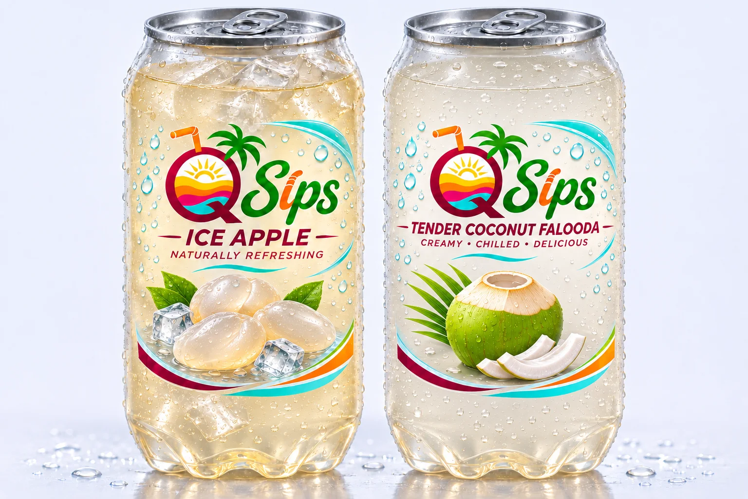
Transparent drink-can mockups present Ice Apple and Tender Coconut Falooda. The final packaging direction uses the Qsips mark with separate product names.
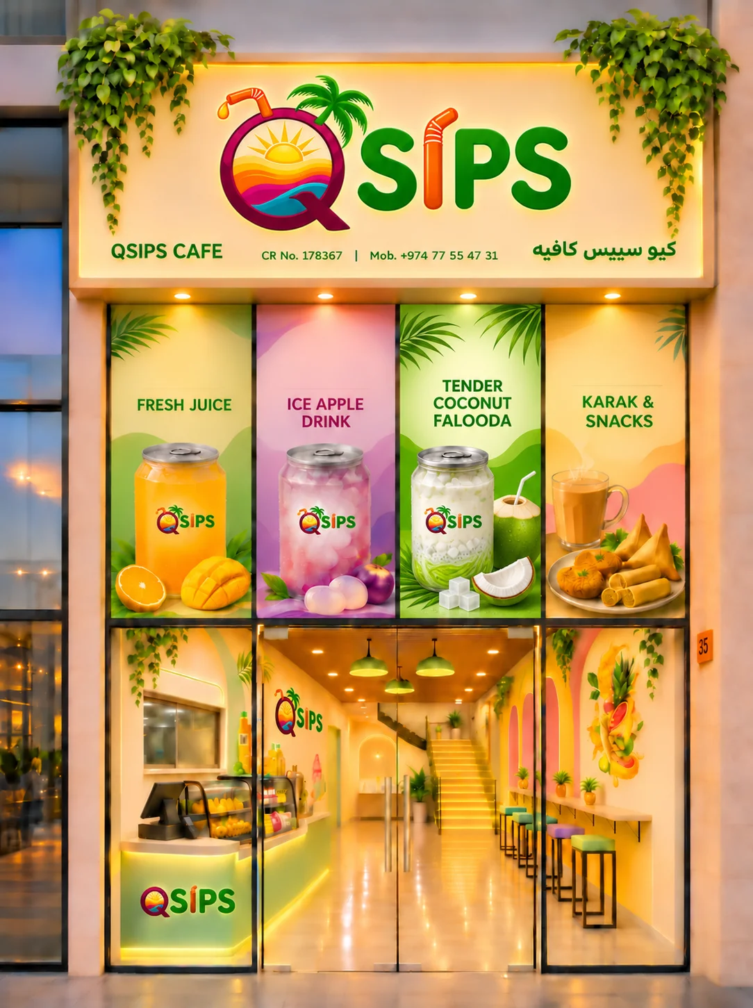
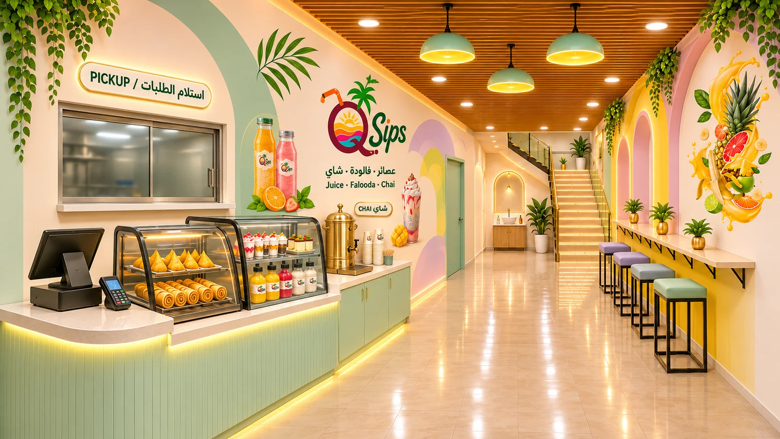
Storefront and interior visualizations extend the brand into signage, displays and customer touchpoints. These are design concepts, not photographs of a completed café.
03 / THE WORK & DESIGN DEVELOPMENT

04 / OUTCOME & NEXT DETAILS
A coordinated brand and café concept proposal with identity, packaging and spatial visualizations. The project is presented as concept development; fabrication, launch and business results are not claimed.